📌 Introduction
You have roughly three seconds before a visitor decides to stay or leave. In that window, template clutter and vague headlines lose money silently.
High-performance custom homepages are engineered to win those seconds with clarity, speed, and an unmistakable next step for UK service businesses.
🚀 What Happens in the First Scroll
Visitors subconsciously ask whether they understand you, whether you are relevant, whether you look credible, and what to do next. Fuzzy answers create bounces.
- ✅ Buried offers: value proposition appears too late
- ✅ Slow hero media: mobile users leave before content paints
- ✅ Weak CTAs: next step is unclear or low contrast
- ✅ Generic trust cues: stock badges that do not reassure
- ✅ Distracting motion: effects compete with the message
💡 Above-the-Fold Essentials
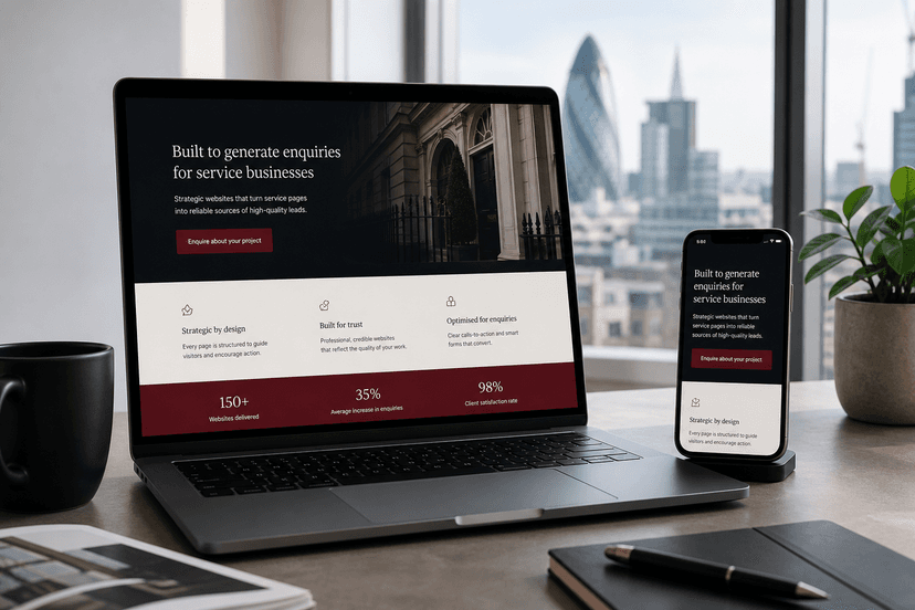
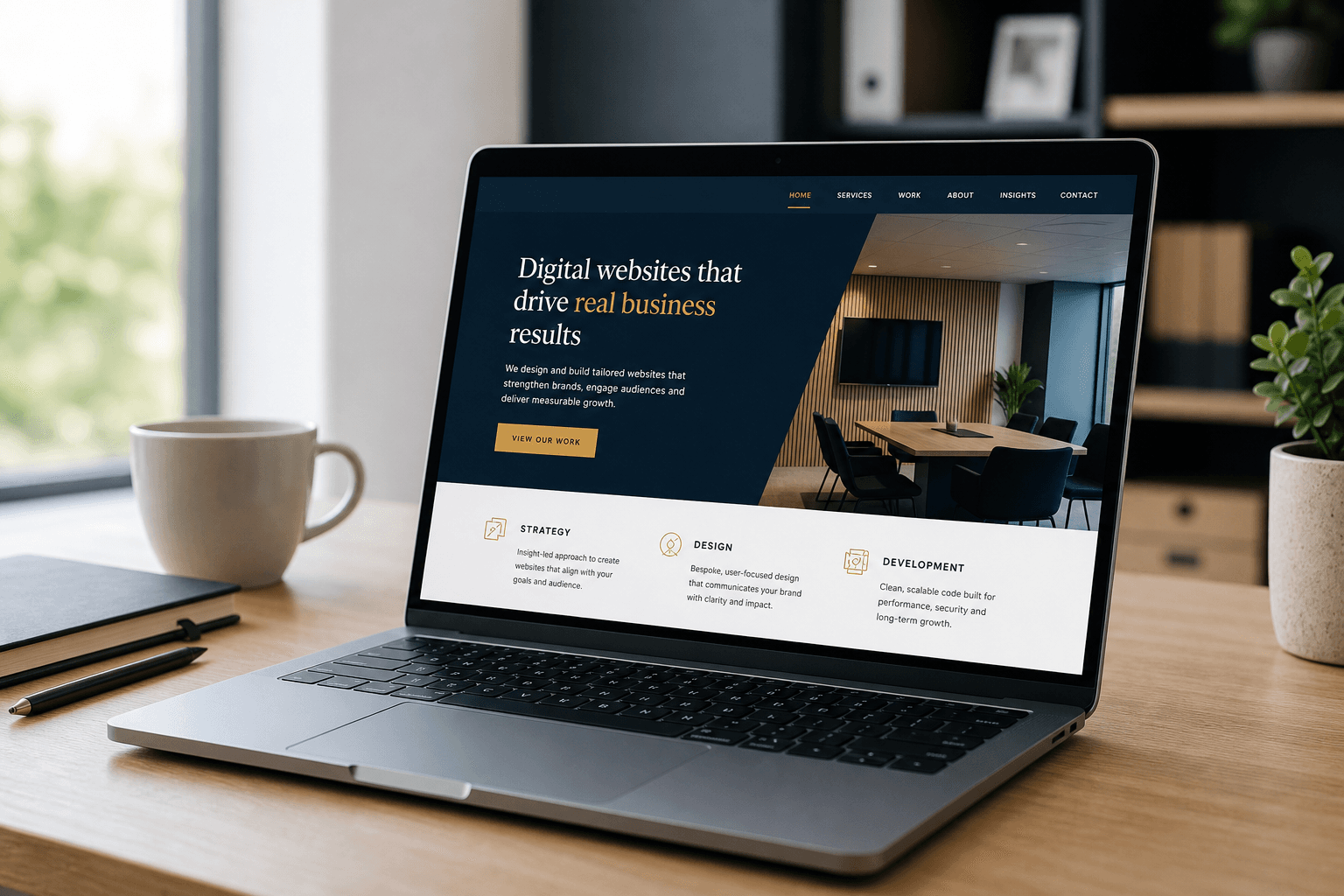
Treat the first screen as a conversion instrument. Specific headline, supporting proof, primary CTA, trust cues, and fast visuals — then guide deeper with purposeful sections.
1. Specific headline
State who you help and the outcome. Avoid poetic vagueness that forces visitors to decode your business.
2. Speed as brand
A slow homepage feels low-quality even when copy is strong. Custom builds avoid theme bloat so first impressions are lightning-fast.
3. Structure beyond the hero
Services, proof, process, and FAQs each need a job. Do not rely on a long undifferentiated template stack.
⚡ Performance Details That Matter
Compress media, prioritise critical content, and remove unused scripts. Measure on real mobile conditions. Re-test after content changes.
- ✅ Offer visible without scrolling on mobile
- ✅ CTA contrast and wording unmistakable
- ✅ Core Web Vitals support a premium feel
🧭 Journey Continuity
After the homepage converts attention, deeper pages and optional apps should continue the same story. Consistency compounds trust.
🛠️ Recommended Delivery Process
A clear process keeps ambitious small businesses focused on outcomes — not technical distractions. Here is a practical sequence we recommend when investing in high-performance custom systems.
- Discover goals, audience, and conversion definition of success
- Map information architecture and customer journeys
- Design and engineer a high-performance custom foundation
- QA for speed, accessibility, security, and conversion paths
- Launch with content training and a measurement plan
✅ Action Checklist
- ✅ Clarify commercial outcomes before design begins
- ✅ Prioritise lightning-fast mobile performance
- ✅ Prefer custom foundations over fragile template stacks
- ✅ Plan for e-commerce or app expansion on one database
- ✅ Measure conversion quality after launch — not vanity traffic alone
❓ Frequently Asked Questions
Will this work for a small team?
Yes. We prioritise modern secure content systems and clear journeys so small teams can operate without a full-time developer for everyday updates.
Do you use templates?
No. Karol Digital engineers 100% custom digital assets without template bloat — focused on speed, security, and conversion.
Can website, store, and app stay in sync?
Yes. With a unified database approach, updates to products, services, or bookings can appear across channels in real time.
🎯 Key Takeaways
Premium growth comes from modern, fast, high-quality digital systems engineered around real customer journeys. Template shortcuts create short-term comfort and long-term friction. Custom websites, conversion-focused e-commerce modules, and bespoke mobile applications create an ecosystem your team can run with confidence.
- ⚡ Prioritise lightning-fast performance as a conversion feature
- 🔒 Prefer rock-solid custom foundations over fragile plugin stacks
- 📈 Design every key page with one commercial job
When you evaluate partners, ask how they will protect performance as content grows, how content editors will work day to day, and how future e-commerce or mobile application layers will connect to the same source of truth. Those questions separate premium custom engineering from short-term template projects.
Also document success metrics before design begins: qualified enquiry volume, booking completion, checkout rate, or repeat purchase frequency. High-performance digital systems should be judged by commercial clarity — not by how many decorative sections appear on a page.
Finally, plan governance: who updates services, who approves proof points, and how often you review analytics. A modern platform stays valuable when your team can operate it confidently, securely, and consistently across website, store, and app experiences.
For homepage has 3 seconds are you wasting them, the strategic theme remains consistent: invest in custom, conversion-focused infrastructure that compounds trust. Karol Digital helps small businesses do exactly that with clear scoping, fixed quotes, and engineering standards built for long-term growth.
When you evaluate partners, ask how they will protect performance as content grows, how content editors will work day to day, and how future e-commerce or mobile application layers will connect to the same source of truth. Those questions separate premium custom engineering from short-term template projects.
- 📱 Plan for retention with apps that sync to your website and store
- 🧩 Keep one unified database so customers never see conflicting information
🚀 Ready to Move Forward with Karol Digital?
Karol Digital partners with ambitious small businesses as a high-performance technical partner — building 100% custom websites, conversion-focused e-commerce platforms, and custom mobile applications (iOS & Android) without template bloat.
If you want clarity before you invest, start with a Website Performance & Growth Audit. If you already know you need a premium system, book a consultation and we will scope a homepage that converts in the first three seconds with a clear fixed quote before any build starts.
👉 Next step: Explore our services and pricing pages, or contact us to request a custom project quote. Bespoke strategies. High-quality engineering outcomes.