📌 Introduction
Most UK service businesses do not lose leads on the homepage alone. They lose them on the service pages — the pages buyers actually compare when they are close to contacting someone.
A visitor may land from Google, an AI overview, a referral, or a paid campaign. Within moments they ask three commercial questions: Do you do what I need? Can I trust you? What should I do next? If your service page answers those questions slowly, vaguely, or in the wrong order, the enquiry goes to a competitor with a clearer journey.
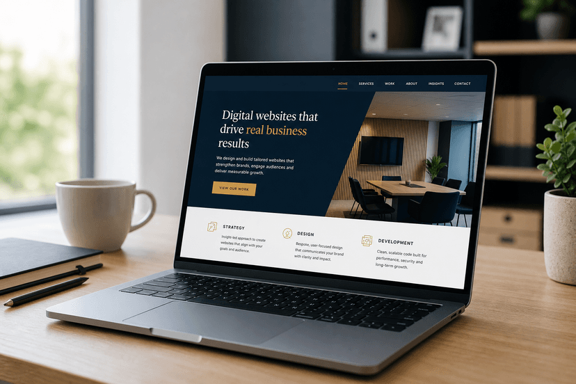
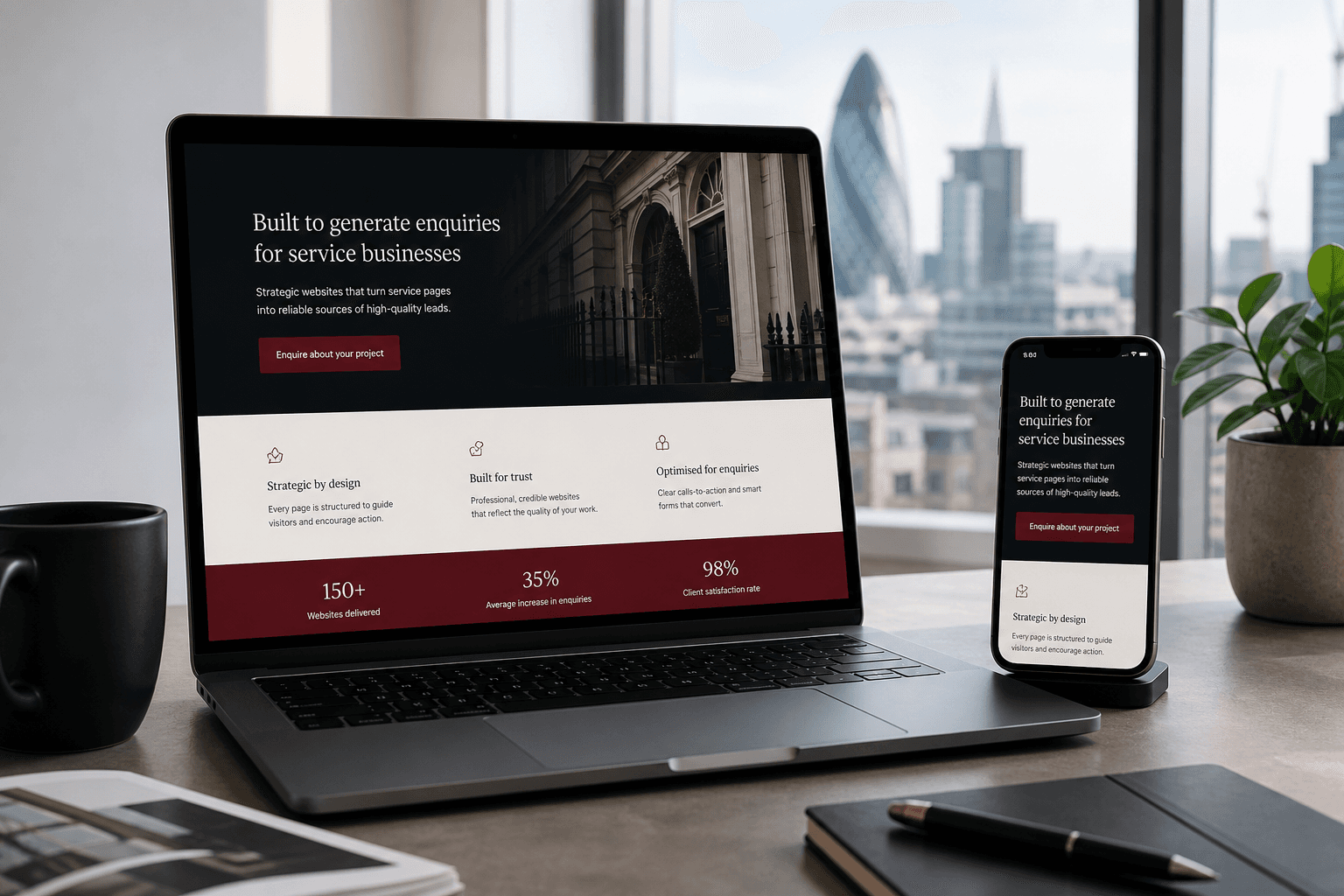
This guide shows how Karol Digital engineers conversion-focused service pages for ambitious UK small businesses — modern, fast, high-quality pages built as lead-generation assets, not brochure filler.
🚀 Why Typical Service Pages Fail to Convert
Template service pages often reuse the same layout for every offer: a hero, a wall of features, stock icons, and a generic “Contact us” button. That structure looks complete in a demo. In real buying behaviour, it creates friction.
- ✅ Vague positioning: visitors cannot tell who the page is for or what outcome you deliver
- ✅ Feature dumps: long lists of capabilities with no commercial hierarchy
- ✅ Weak proof placement: testimonials and credentials appear after interest has already cooled
- ✅ Slow mobile experience: heavy media and plugin widgets delay the first clear call to action
- ✅ Friction-heavy forms: too many fields, unclear privacy language, or broken validation on phones
- ✅ No next-step clarity: multiple competing CTAs that dilute action instead of guiding it
When every section shouts equally, nothing sells. Conversion-focused pages decide what the visitor must understand first — then remove everything that competes with that job.
💡 What a High-Performance Service Page Actually Does
A service page is not a catalogue entry. It is a guided sales conversation in digital form. The best pages for UK service businesses do four jobs in sequence: attract the right intent, reassure doubt, prove credibility, and make the enquiry feel low-risk and obvious.
1. Attract the right intent above the fold
The first screen should name the service, the audience, and the outcome in plain language. Fancy slogans help branding only when they still communicate commercial clarity. If a solicitor, builder, caterer, or studio owner cannot instantly recognise themselves in your opening lines, they will bounce.
- 🎯 Specific service language over vague “solutions” copy
- 📍 Local or sector cues when they improve relevance
- 📞 One primary CTA that matches buyer readiness
2. Reassure doubt before you ask for contact details
Buyers arrive with objections: price uncertainty, timeline anxiety, quality risk, and “will this be worth my time?” Address those concerns early with process clarity, scope boundaries, and what happens after they enquire — not with more feature bullets.
- 🧭 Simple process steps that reduce uncertainty
- ⏱️ Realistic timelines and response expectations
- 🔒 Trust signals near the moment of decision
3. Prove credibility where scepticism peaks
Proof works hardest when it answers a specific doubt. Case outcomes, sector experience, reviews, certifications, and before/after examples belong beside the claims they support — not buried in a footer carousel.
4. Make the enquiry the easiest next step
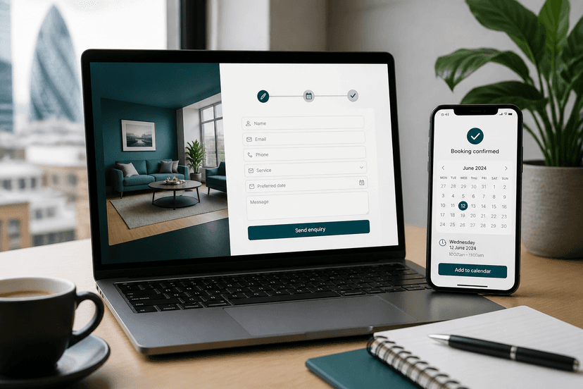
If the page persuades well but the form feels risky or tedious, you still lose. High-converting enquiry paths are short, mobile-friendly, and transparent about what happens next.
🧱 The Conversion Architecture We Recommend
Karol Digital builds custom service pages with a commercial architecture rather than rearranging stock blocks. The exact sections vary by industry, but the hierarchy is consistent for lead generation.
- Hero with service outcome, audience fit, and a single primary CTA
- Problem framing that shows you understand the buyer’s situation
- Offer clarity: what is included, who it is for, and what is not included
- Proof cluster: results, reviews, credentials, or relevant project snapshots
- Process overview so the enquiry feels structured and safe
- Objection handling for price, timing, scope, and trust
- Final CTA with a short form or direct contact path
This structure keeps the page readable for humans and easier for search engines and AI answer systems to summarise accurately — which supports both classic SEO and modern AI search visibility.
✍️ Copy That Sells Without Sounding Salesy
Conversion copy is not louder copy. It is clearer copy. UK service buyers respond to specificity: the type of project, the type of client, the constraints you handle, and the outcome you protect.
- ✅ Outcome-led headlines: state the result the visitor wants, not your internal service label alone
- ✅ Audience filters: help the wrong visitors self-select out early — that improves enquiry quality
- ✅ Plain-English process: explain how engagement starts without jargon walls
- ✅ One commercial job per section: avoid mixing FAQ, pricing, and biography into one dense block
If a sentence could sit on any competitor’s website unchanged, it is probably too generic to convert. Custom messaging is a competitive advantage — especially in crowded London and UK service markets.
⚡ Speed, Mobile, and Technical Trust
Design and copy cannot rescue a slow page. Mobile visitors judge professionalism through load time, tap targets, and whether the form works on the first attempt. High-performance custom development treats speed as a conversion feature.
- ✅ Fast first paint: critical content appears before heavy decorative assets
- ✅ Lean forms: only ask for fields you will use in qualification
- ✅ Stable layouts: no jumping CTAs as images load
- ✅ Secure foundations: rock-solid custom builds instead of fragile plugin stacks
This is why ambitious small businesses move away from bloated template platforms. A modern Next.js foundation, clean content structure, and conversion-focused engineering protect both user experience and long-term maintainability.
📱 Mobile Enquiry Journeys That Actually Complete
Most service enquiries start on a phone. If your service page requires pinch-zooming, tiny buttons, or a ten-field form, conversion collapses even when interest is high.
- 📱 Sticky or repeated CTA access without covering content awkwardly
- ⌨️ Mobile keyboards that match field types (email, tel, text)
- 🧾 Short forms with optional detail fields rather than mandatory essays
- 📞 Click-to-call as a secondary path for high-intent local buyers
For businesses that later need bookings, packages, or repeat customers, the same custom foundation can extend into e-commerce modules or mobile applications that share one unified database with the website — so leads, customers, and orders stay consistent.
🛠️ A Practical Rebuild Process
A clear process keeps ambitious small businesses focused on outcomes — not technical distractions. Here is a practical sequence we recommend when upgrading service pages into lead-generation assets.
- Audit current pages for clarity, proof gaps, speed, and form friction
- Map the real sales conversation for each priority service
- Rewrite information architecture around one commercial job per page
- Design conversion hierarchy for desktop and mobile
- Engineer a high-performance custom build with measurable CTAs
- Launch, monitor enquiry quality, and refine messaging with real data
✅ Service Page Conversion Checklist
- ✅ Clear offer in the first viewport: service + audience + outcome
- ✅ Primary CTA matches intent: enquire, book, or request a quote — not a vague “learn more”
- ✅ Proof near claims: reviews and results support specific promises
- ✅ Process reduces risk: buyers know what happens after they submit
- ✅ Mobile form works first time: fast, short, and readable
- ✅ Page loads quickly: performance treated as part of trust
- ✅ SEO and AI-ready structure: clear headings, entities, and citable answers
❓ Frequently Asked Questions
Do I need a separate page for every service?
Usually yes for core revenue services. Bundling everything onto one generic “Services” page makes comparison harder for buyers and weaker for search visibility. Priority services deserve dedicated conversion journeys.
Should pricing appear on the service page?
When ranges or packages reduce uncertainty, yes. When every project is scoped, explain how quoting works and what information you need — transparency still converts even without a fixed number.
Can a template page be “good enough”?
Templates can launch quickly, but they often struggle with unique positioning, speed, and enquiry quality as competition rises. Custom high-performance pages are built around how you sell, not around a theme’s default sections.
How does this connect to SEO and AI search?
Clear service pages are easier to rank and easier for answer engines to cite. Structured headings, specific language, and trustworthy proof help both classic search and AI Overviews understand what you offer.
🎯 Key Takeaways
Service pages convert when they behave like guided sales conversations: clear offer, earned trust, obvious next step, and technical performance that does not break momentum. Brochure layouts waste paid and organic traffic. Conversion-focused custom pages turn that traffic into qualified enquiries.
- ⚡ Treat speed and mobile usability as conversion features
- 🧭 Give every service page one commercial job
- 📈 Place proof where doubt appears
- 📞 Make the enquiry path short, clear, and low-risk
- 🧩 Build on a custom foundation you can extend into store or app workflows later
🚀 Ready to Move Forward with Karol Digital?
Karol Digital partners with ambitious UK small businesses as a high-performance technical partner — building 100% custom websites, conversion-focused service journeys, e-commerce modules, and mobile applications without template bloat.
If your service pages attract traffic but not enquiries, start with a Website Performance & Growth Audit. We will identify clarity gaps, friction points, and the highest-ROI rebuild opportunities — then scope a fixed-quote plan before any build starts.
👉 Next step: Explore our web design and custom development services, or contact us to request a project quote. Bespoke strategies. High-quality engineering outcomes.